Separation model drawbacks
This is a work-in-progress inspired by a recent conversation.
In the "separation model" in FileMaker, where data tables live in separate files from an "interface file" containing visual layouts that display the data to the user, used to be widely recommended as a development convention. However, many developers have found that it has significant drawbacks. This is a scratchpad list of those drawbacks as I encounter them.
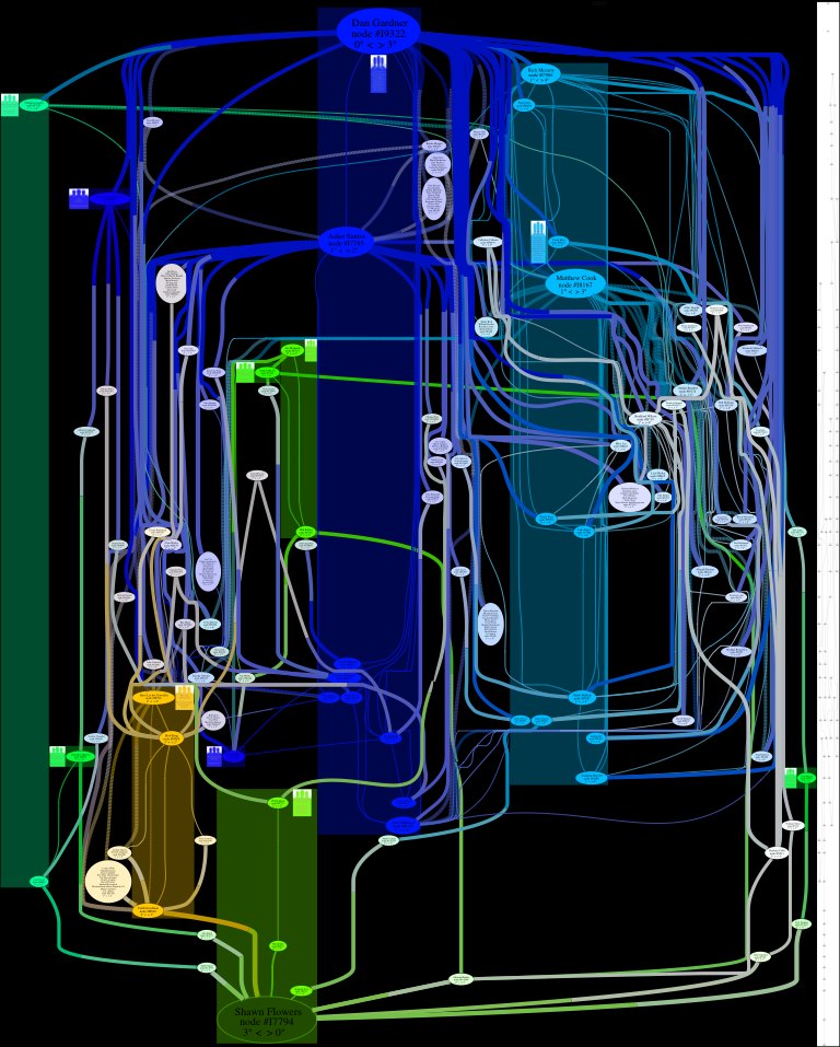
1. Duplicate relationship graphsIn practice, relationships depend on context, and this is provided by table occurrences that layouts are built on. You may need a portal on a layout... that means the relationship must be in the interface file. But you may have a calculated field in the parent record that counts, summarizes, or otherwise performs an aggregate operation on the related records. That means the relationship must be in the data file. Neither of these is unusual at all. So you…


 I have to be honest. I don't know about this one.
 Back in 2009 my old ex-friend Rick Abruzzo, whom I'd met some years earlier during a mutual effort to resuscitate the soggy corpse of the San Francisco Cacophony Society, invited me to come down with my guitar and fill some airtime on
 This one is finished except for the final production and mastering... it needs some studio gloss on it.