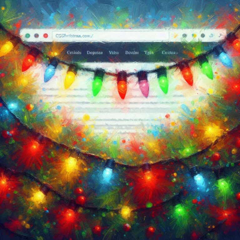
Strung across the very top of this page are pure CSS interactive Christmas lights. You can slowly move your mouse across them to jostle them and they'll move, all without any javascript. The twisty cord is CSS too. There's also a broken bulb, look out!
Update, Dec. 2025: these lights are now available as a free WordPress plugin, from my Github repo at https://github.com/kupietools/ktwp-wp-plugin-css-holiday-lights/ (And, additional update: someone in the world has installed it! See bottom.)
They're also available as a CodePen demo at https://codepen.io/kupietz/pen/dPbNywN.
How it's done
First off, here's how it's done.
The only HTML necessary is to put this in your page wherever you want the lights:
<ul id="lightrope"><li><div></div></li><li><div></div></li>

 	<li><div></div></li><li><div></div></li>

 	<li class="broken"><div></div></li><li><div></div></li>

        <li><div></div></li><li><div></div></li>

 	<li><div></div></li><li><div></div></li>

 	<li><div></div></li><li><div></div></li>

 	<li><div></div></li><li><div></div></li>

 	<li><div></div></li><li><div></div></li>

 	<li><div></div></li><li><div></div></li>

 	<li><div></div></li><li><div></div></li>

 	<li><div></div></li><li><div></div></li>

 	<li><div></div></li><li><div></div></li>

 	<li><div></div></li><li><div></div></li>

 	<li><div></div></li><li><div></div></li>

 	<li><div></div></li><li><div></div></li>

 	<li><div></div></li><li><div></div></li>

 	<li><div></div></li><li><div></div></li>

 	<li><div></div></li><li><div></div></li>

 	<li><div></div></li><li><div></div></li>

 	<li><div></div></li><li><div></div></li>

 	<li><div></div></li><li><div></div></li>

</ul>
Each <li> is a bulb. You can add or remove as many of the <li> tags as you need to make the string the width you want. Note that class="broken" for the broken bulb.
Then, you just need this CSS somewhere in the page, wherever you've got your site's CSS:
/* xmas lights */
#lightrope {
  text-align: center;
  white-space: nowrap;
  overflow: hidden;
  position: fixed;
  z-index: 1000;
  margin: -15px 0 0 0;
  padding: 0;
  pointer-events: none;
  width: 100%;
}

#lightrope > li {
  position: relative;
  display: inline-block;
  list-style: none;
  margin: 20px 20px 20px 22px;
}

#lightrope > li > div {
  position: relative;
  border-left: 2px solid rgba(0,0,0,.05);
  border-right: 2px solid rgba(255,255,255,.5);
  margin: 2px 0 0 -3px;
  padding: 0;
  display: block;
  width: 8px;
  height: 18px;
  border-radius: 50%;
  transform-origin: top center;
  -webkit-animation-fill-mode: forwards;
  animation-fill-mode: forwards;
  pointer-events: auto;
}

/* Colors for different bulbs */
#lightrope > li:nth-child(5n+0) > div {
  -webkit-animation-duration: 0.8s, 4.1s, 3s;
  animation-duration: 0.8s, 4.1s, 3s;
}

#lightrope > li:nth-child(5n+1) > div {
  -webkit-animation-duration: .9s, 4.3s, 3s;
  animation-duration: .9s, 4.3s, 3s;
}

#lightrope > li:nth-child(5n+2) > div {
  -webkit-animation-duration: 1s, 4.5s, 3s;
  animation-duration: 1s, 4.5s, 3s;
}

#lightrope > li:nth-child(5n+3) > div {
  -webkit-animation-duration: 1.1s, 4.7s, 3s;
  animation-duration: 1.1s, 4.7s, 3s;
}

#lightrope > li:nth-child(5n+4) > div {
  -webkit-animation-duration: 1.2s, 4.9s, 3s;
  animation-duration: 1.2s, 4.9s, 3s;
}

/* Animation assignments */
#lightrope > li:nth-child(4n+0) > div {
  -webkit-animation-name: flash-all, sway, flickPendulum;
  animation-name: flash-all, sway, flickPendulum;
  -webkit-animation-timing-function: linear, ease-in-out, cubic-bezier(0.215, 0.61, 0.355, 1);
  animation-timing-function: linear, ease-in-out, cubic-bezier(0.215, 0.61, 0.355, 1);
  -webkit-animation-iteration-count: infinite, infinite, 1;
  animation-iteration-count: infinite, infinite, 1;
  background: #00f7a5;
  box-shadow: 0px 4.6666666667px 24px 3px #00f7a5;
}

#lightrope > li:nth-child(4n+1) > div {
  -webkit-animation-name: flash-all, sway, flickPendulum;
  animation-name: flash-all, sway, flickPendulum;
  -webkit-animation-timing-function: linear, ease-in-out, cubic-bezier(0.215, 0.61, 0.355, 1);
  animation-timing-function: linear, ease-in-out, cubic-bezier(0.215, 0.61, 0.355, 1);
  -webkit-animation-iteration-count: infinite, infinite, 1;
  animation-iteration-count: infinite, infinite, 1;
  background: #0CF;
  box-shadow: 0px 4.6666666667px 24px 3px #0CF;
}

#lightrope > li:nth-child(4n+2) > div {
  -webkit-animation-name: flash-all, sway, flickPendulum;
  animation-name: flash-all, sway, flickPendulum;
  -webkit-animation-timing-function: linear, ease-in-out, cubic-bezier(0.215, 0.61, 0.355, 1);
  animation-timing-function: linear, ease-in-out, cubic-bezier(0.215, 0.61, 0.355, 1);
  -webkit-animation-iteration-count: infinite, infinite, 1;
  animation-iteration-count: infinite, infinite, 1;
  background: #f76666;
  box-shadow: 0px 4.6666666667px 24px 3px #f76666;
}

#lightrope > li:nth-child(4n+3) > div {
  -webkit-animation-name: flash-all, sway, flickPendulum;
  animation-name: flash-all, sway, flickPendulum;
  -webkit-animation-timing-function: linear, ease-in-out, cubic-bezier(0.215, 0.61, 0.355, 1);
  animation-timing-function: linear, ease-in-out, cubic-bezier(0.215, 0.61, 0.355, 1);
  -webkit-animation-iteration-count: infinite, infinite, 1;
  animation-iteration-count: infinite, infinite, 1;
  background: #FFEE33;
  box-shadow: 0px 4.6666666667px 24px 3px #FFEE33;
}

#lightrope > li > div:hover {
  -webkit-animation: flash-all 0.8s infinite linear;
  animation: flash-all 0.8s infinite linear;
}

/* Special case for the fifth light */
#lightrope > li.broken > div {
  left: -2px;
  background: #CCC !important;
  border-left: 2px solid #BDE;
  border-right: 2px solid #DEF;
  box-shadow: none !important;
  -webkit-animation-name: none !important;
  animation-name: none !important;
  -webkit-animation-duration: 0s !important;
  animation-duration: 0s !important;
  -webkit-transform: rotatez(15deg) !important;
  transform: rotatez(15deg) !important;
}

/* Bulb top and cord */
#lightrope > li:before {
  content: "";
  position: absolute;
  background: #262;
  width: 4px;
  height: 8px;
  border-radius: 3px;
  top: -4.6666666667px;
  left: -1px;
  border-left: 2px solid rgba(0,0,0,.05);
  border-right: 2px solid rgba(255,255,255,.5);
}

#lightrope > li::after {
  content: "";
  top: -12px;
  left: -1px;
  position: absolute;
  width: 58px;
  height: 18.6666666667px;
  border-bottom: solid #262 2px;
  border-radius: 50%;
  background: #060;
  --mask: radial-gradient(5.66px at 50% calc(100% + 4.2px),#0000 calc(99% - 1px),#000 calc(101% - 1px) 99%,#0000 101%) calc(50% - 6px) calc(50% - 2px + .5px)/12px 4px repeat-x,
          radial-gradient(5.66px at 50% -4.2px,#0000 calc(99% - 1px),#000 calc(101% - 1px) 99%,#0000 101%) 50% calc(50% + 2px)/12px 4px repeat-x,
          radial-gradient(7.38px at 50% calc(100% + 5.6px),#0000 calc(99% - 1px),#000 calc(101% - 1px) 99%,#0000 101%) calc(50% - 8px) calc(50% - 2.5px + .5px)/16px 5px repeat-x,
          radial-gradient(7.38px at 50% -5.6px,#0000 calc(99% - 1px),#000 calc(101% - 1px) 99%,#0000 101%) 50% calc(50% + 2.5px)/16px 5px repeat-x;
  -webkit-mask: var(--mask);
  mask: var(--mask);
}

#lightrope li:last-child:after {
  content: none;
}

#lightrope li:first-child {
  margin-left: -40px;
}

/* Animations */
@-webkit-keyframes flickPendulum {
  0% { -webkit-transform: rotate(0deg); transform: rotate(0deg); }
  10% { -webkit-transform: rotate(20deg); transform: rotate(20deg); }
  20% { -webkit-transform: rotate(-18deg); transform: rotate(-18deg); }
  30% { -webkit-transform: rotate(15deg); transform: rotate(15deg); }
  40% { -webkit-transform: rotate(-12deg); transform: rotate(-12deg); }
  50% { -webkit-transform: rotate(9deg); transform: rotate(9deg); }
  60% { -webkit-transform: rotate(-6deg); transform: rotate(-6deg); }
  70% { -webkit-transform: rotate(4deg); transform: rotate(4deg); }
  80% { -webkit-transform: rotate(-2deg); transform: rotate(-2deg); }
  90% { -webkit-transform: rotate(1deg); transform: rotate(1deg); }
  100% { -webkit-transform: rotate(0deg); transform: rotate(0deg); }
}

@keyframes flickPendulum {
  0% { transform: rotate(0deg); }
  10% { transform: rotate(20deg); }
  20% { transform: rotate(-18deg); }
  30% { transform: rotate(15deg); }
  40% { transform: rotate(-12deg); }
  50% { transform: rotate(9deg); }
  60% { transform: rotate(-6deg); }
  70% { transform: rotate(4deg); }
  80% { transform: rotate(-2deg); }
  90% { transform: rotate(1deg); }
  100% { transform: rotate(0deg); }
}

@-webkit-keyframes flash-all {
  0%, 25%, 75%, 100% { opacity: 1; }
  50% { opacity: .45; }
}

@keyframes flash-all {
  0%, 25%, 75%, 100% { opacity: 1; }
  50% { opacity: .45; }
}

@-webkit-keyframes sway {
  0%, 100% { -webkit-transform: rotate(0.5deg); transform: rotate(0.5deg); }
  50% { -webkit-transform: rotate(-0.5deg); transform: rotate(-0.5deg); }
}

@keyframes sway {
  0%, 100% { transform: rotate(0.5deg); }
  50% { transform: rotate(-0.5deg); }
}
/* end of xmas lights */
And that's it! That's all you need for the lights you see.
Background
These were adapted from an original demo by user "toby" on codepen.io at https://codepen.io/tobyj/pen/QjvEex:
My implementation (with very minor differences from the implementation here on my own site as given above) at https://codepen.io/kupietz/pen/dPbNywN:
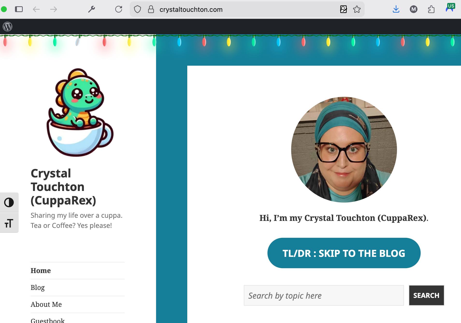
New news! We have a first! As of Dec 5, 2025, Crystal Touchton (CuppaRex) has installed my WordPress CSS Interactive Holiday Lights Plugin on her site https://crystaltouchton.com - the first time I've seen my software running on someone I didn't know's website. Thanks, Crystal!


